Quietly Crafted. Deeply Felt.
Quietly Crafted. Deeply Felt.
Blog Detail
11/07/2026 | 21 Min Read
Kitchen Color Combinations That Never Go Out of Style
The kitchen is the undisputed anchor of the modern home. It is a high-traffic zone where structural durability meets daily sensory experience. Because a kitchen renovation involves significant capital investment—spanning premium cabinetry, heavy-duty quartz or granite countertops, and built-in appliances—selecting a passing color trend can quickly make your home feel dated.
When designing a space intended to last for decades, the secret lies in embracing timeless palettes that balance visual depth with light reflectivity. By prioritizing classic harmony over temporary fads, you can create a culinary hub that remains elegant and fresh through shifting design eras.
As a core element of high-end simple interior design, a classic kitchen palette should enhance natural light, conceal everyday wear, and feel effortlessly sophisticated. Here are four enduring kitchen color combinations that permanently retain their aesthetic and market value.
1. The High-Contrast Classic: Tuxedo Charcoal and Crisp White
Few palettes command a space quite like the timeless "Tuxedo" configuration. By anchoring the lower section of the room with a deep, grounded tone and keeping the eye-level surfaces light, this palette strikes a perfect structural balance.
- The Palette Layout: Matte charcoal or deep slate grey for the base cabinets and kitchen island, paired with pristine, high-reflective white for the overhead cabinetry, backsplash, and countertops.
- Why It Endures: Placing the darker shade on the base units visually anchors the room and hides the scuffs and footprints common to high-traffic cooking zones. kitchen color combinations The bright upper cabinetry reflects both natural and ambient light, ensuring the room feels open, airy, and expansive.
- The Design Detail: Pair this combination with brushed brass or matte black hardware. A seamless white quartz countertop with subtle grey veining beautifully ties the two contrasting halves together.
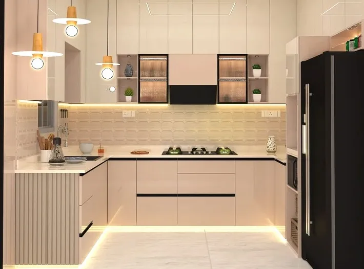
2. Monochromatic Sophistication: Warm Taupe, Cream, and Soft Beige
For homeowners who appreciate a calm, cohesive environment, a layered neutral palette offers unmatched warmth and timeless sophistication. This approach is highly effective for creating an inviting, family-centric atmosphere.
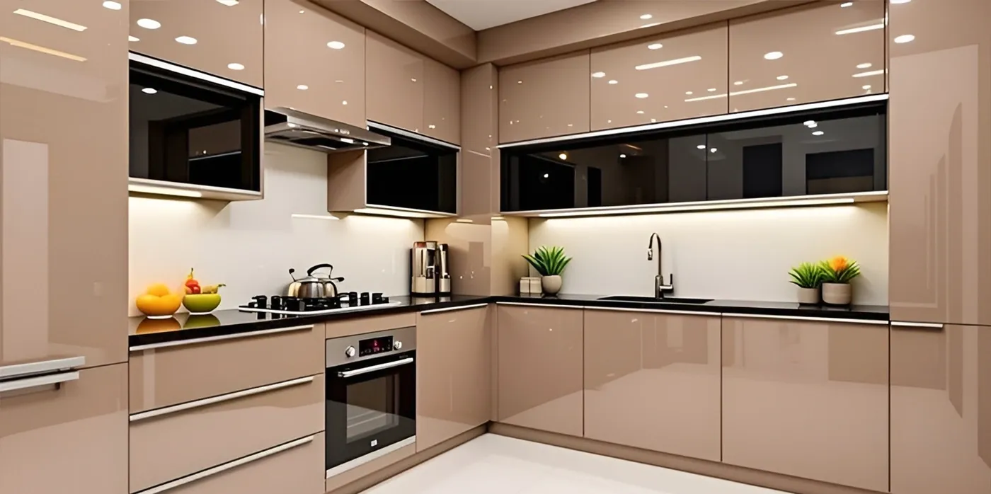
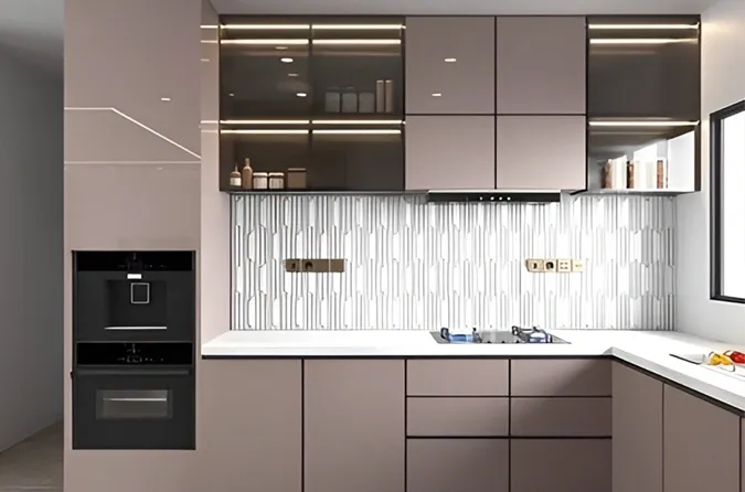
- The Palette Layout: Muted taupe or mushroom-colored cabinetry paired with soft cream walls and warm beige natural stone surfaces.
- Why It Endures: Pure stark white can occasionally feel clinical under bright overhead task lighting. Layering varying tones of beige and warm grey introduces a welcoming, tactile depth while maintaining a beautifully simple kitchen colour profile.
- The Design Detail: Because the color scheme is intentionally understated, focus heavily on textural variety. Incorporating fluted cabinet panels, a subtly textured handmade tile backsplash, or a honed limestone floor prevents the monochromatic look from feeling flat or uninspiring.
3. The Naturalist Balance: Sage Green and Muted Oak
Bringing organic, nature-inspired elements indoors is a design strategy that transcends temporary trends. Muted greens act as soft neutrals, injecting personality into the home without overwhelming the visual senses.
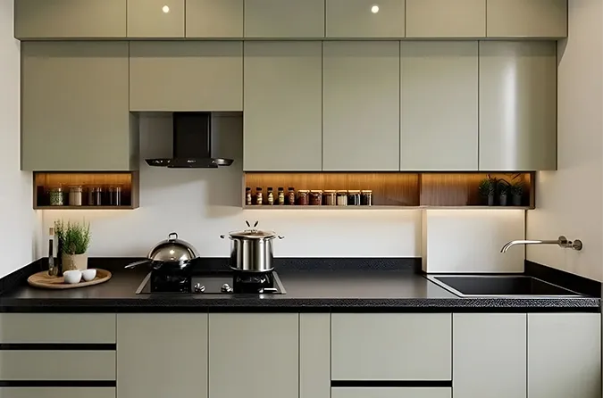
- The Palette Layout: Soft sage green or olive-toned cabinetry combined with natural, light oak wood accents on open shelving, island panels, or ceiling beams.
- Why It Endures: Sage green balances warmth and coolness beautifully, reacting gracefully to changing daylight hours. When paired with the organic grain of natural wood, simple interior design it creates a serene, grounded environment that feels both contemporary and deeply traditional.
- The Design Detail: This simple kitchen colour combination pairs exceptionally well with matte white solid-surface countertops and brushed copper or satin-nickel handles, enhancing the home's organic aesthetic.
4. Maritime Elegance: Deep Navy Blue and Warm Alabaster
Navy blue functions beautifully as a dependable neutral in luxury residential design. It offers the dramatic impact of a dark color while retaining a softer, more sophisticated undertone than pure black.
- The Palette Layout: Rich navy blue for the entire lower cabinet run and central island, contrasted against soft alabaster or milk-white upper elements.
- Why It Endures: Navy blue evokes a sense of stability, order, and premium craftsmanship. It offers an excellent backdrop for high-end stainless steel or integrated built-in appliances, making it a staple choice for premium simple home interior design.
- The Design Detail: To keep the navy blue from absorbing too much light, use a highly polished white marble or seamless engineered stone countertop to bounce light effectively across the working zones.
Three Rules for Mastering Kitchen Color Longevity
To ensure your chosen color palette functions flawlessly over time, keep these professional implementation guidelines in mind:
- Respect the 60-30-10 Color Rule: Allocate 60% of your kitchen's visible surface area (typically walls and dominant cabinetry) to your primary neutral shade, 30% to your secondary color (island or accent cabinets), and 10% to your accent elements (hardware, light fixtures, and plumbing details).
- Evaluate Under True Lighting Conditions: Paint samples can shift dramatically between morning daylight and evening LED exposure. Always review your physical cabinet swatches and material samples inside the actual kitchen space at multiple points throughout the day before finalizing production.
- Invest in Premium Finish Performance: The quality of the finish matters just as much as the specific shade. For dark colors, utilize high-grade anti-fingerprint matte laminates or premium PU lacquers. For lighter shades, ensure the surfaces feature high UV-resistance ratings to prevent yellowing over years of sun exposure.
Designing a Legacy Space
A truly timeless kitchen avoids flashy, temporary design gimmicks in favor of structural balance, material integrity, and clean color harmony. By choosing a balanced palette that works in harmony with your home's natural light, you ensure your kitchen remains a beautiful, inviting investment for decades to come.
Curate Your Timeless Culinary Space with Native Sutra
Crafting a kitchen that flawlessly balances enduring style with daily functional performance requires deep technical expertise and a meticulous eye for detail. Native Sutra specializes in executing premium, turnkey residential interiors that transition smoothly from initial conceptual planning to precision on-site installation. Our design teams manage material sourcing, strict quality control, and architectural alignment to create spaces tailored specifically to your lifestyle. Connect with our principal consultants today to design a kitchen that truly stands the test of time.
Frequently Asked Questions
1. Which countertop materials work best with a wide variety of kitchen color combinations?
White quartz with subtle, soft grey or gold veining is exceptionally versatile. It complements high-contrast dark cabinets, soft organic greens, and clean monochromatic neutrals equally well. Furthermore, quartz is non-porous and highly scratch-resistant, providing excellent long-term durability for busy homes.
2. How do I prevent a completely neutral or white kitchen from feeling cold and sterile?
The key is introducing layered physical textures and warm wood accents. Using natural timber barstools, open oak shelving, brushed brass metals, or a textured subway tile backsplash breaks up flat surfaces, injecting instant warmth and visual depth without cluttering the color palette.
3. Are high-gloss cabinet finishes still considered timeless?
While high-gloss finishes are highly effective in ultra-modern, compact urban kitchens to reflect light and maximize the illusion of space, matte and satin finishes are generally considered more versatile and enduring. Matte surfaces minimize the visibility of daily smudges, scratches, and fingerprints, maintaining a pristine look over time.
4. What type of lighting should I choose to complement a warm neutral kitchen palette?
Opt for warm-white LED configurations with a color temperature ranging between 3000K and 4000K. This range balances clear, crisp functionality for precise cooking tasks while preserving the natural, cozy undertones of your wood finishes and neutral surfaces without casting an artificial blue tint.