Quietly Crafted. Deeply Felt.
Quietly Crafted. Deeply Felt.
Blog Detail
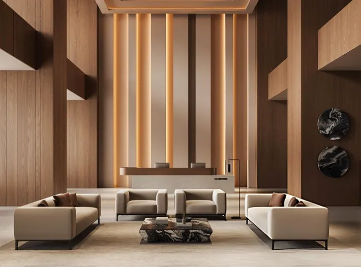
Selecting a color palette for a luxury home is no longer about blindly picking a favorite paint chip or following rigid, one-size-fits-all rules. In Gurgaon’s fast-paced luxury real estate market, where premium high-rises feature massive structural layouts and soaring floor-to-ceiling windows, color plays an essential architectural role. It balances intense natural light, defines open spaces, and establishes a genuine sense of emotional comfort.
For 2026, the local design landscape is experiencing a clear shift away from cold, clinical minimalism and stark, clinical grays. Homeowners are moving toward warmer, more expressive, and deeply grounded spaces.
Let's explore the prominent color trends shaping Gurgaon’s finest properties, along with practical execution insights shared by the top interior designers Gurgaon trusts for high-end styling.
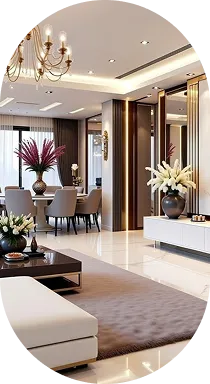
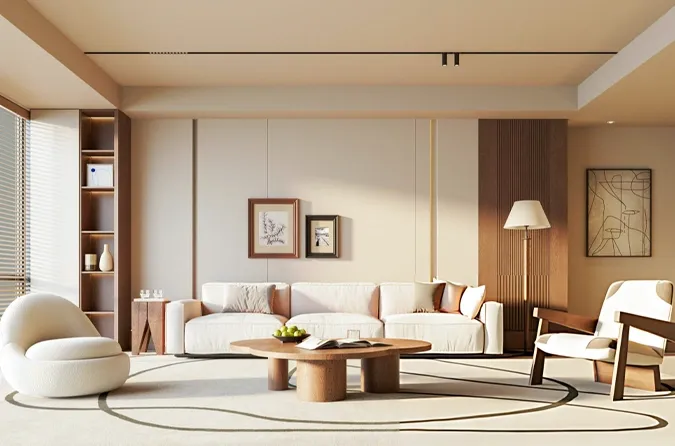
Modern interior design relies on strategic layering. The most successful luxury spaces combine soft, light-reflective base tones with deep, character-rich accent colors to give a room authentic structural depth.
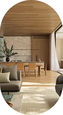
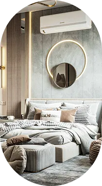
The era of the bright white, gallery-style apartment is fading. best interior decorators in gurgaon To counteract the intense, bright sunlight that fills Gurgaon’s high-rises, designers are turning to softer, more forgiving foundation tones.
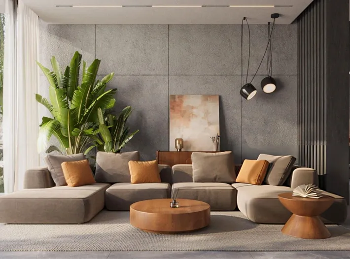
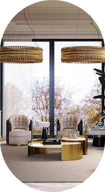
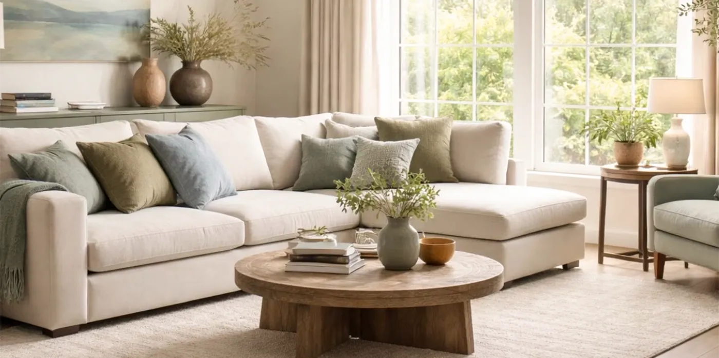
With a growing focus on wellness and creating calm living environments, nature-inspired tones have become essential choices for premium residential projects.
To balance light, airy spaces, 2026 interiors are incorporating rich, grounded colors derived from natural elements.
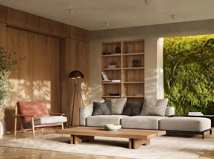
Luxury homes need a clear spatial rhythm—a thoughtful balance between bright, energetic communal rooms and cozy, private sanctuaries.
A color never exists in isolation; its impact depends entirely on the textures and surfaces it interacts with on-site. The best interior decorators in Gurgaon use a disciplined material mix to ensure these modern palettes look balanced and cohesive:
Trend Palette Category
Recommended Base Paint
Ideal Coordinating Natural Wood
Complementary Metal & Stone Accents
Warm Tactile Minimalist
Soft Cream / Warm Alabaster
Light Cured Oak / Natural Ash
Brushed Champagne Gold; Honed Travertine Stone.
Grounded Earth & Clay
Terracotta / Subdued Ochre
Mid-Tone Walnut / Smoked Oak
Antique Bronze; Textured Sandstone or Raw Slate.
Refined Organic Green
Matcha Green / Smoky Olive
Bleached Walnut / Matte Teak
PVD Rose Gold; Polished Calacatta or White Marble.
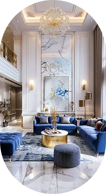
Introspective Jewel Tone
Deep Teal / Rich Velvet Burgundy
Charcoal-Stained Oak / Dark Ebony
Polished Chrome; Patagonia Quartzite or Backlit Onyx.
Bringing a modern color palette to life requires avoiding common site execution mistakes that can disrupt a premium design:
Your home’s color story should be a direct reflection of your personal lifestyle and aesthetic taste. While design trends offer fresh inspiration, executing them successfully requires a deep understanding of scale, lighting, and material craftsmanship.
Partnering with an experienced studio ensures that your favorite colors are beautifully integrated with premium materials, creating a sophisticated space that feels intentional, balanced, and distinctly your own.
Ready to transform your premium Gurgaon residence with a masterfully curated color layout?
Connect with the Native Sutra Design Team today to tour our material gallery, explore our design portfolio, and schedule a personalized color consultation for your upcoming residential project.
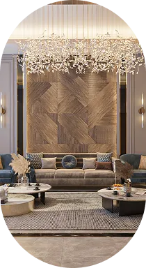
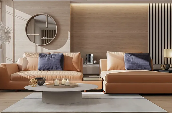
Color drenching involves painting the walls, baseboards, window frames, and the ceiling in the exact same color or closely related shades from the same family. In large luxury layouts, this technique eliminates harsh visual transitions, making rooms feel more cohesive, expansive, and tailored.
The key is intentional restraint. Instead of painting an entire room in a powerful shade like deep burgundy or dark teal, introduce the color through a single focal point, such as a custom kitchen island, a plush velvet lounge chair, or inside a recessed wall alcove.
Cool grays can often feel sterile and detached under modern LED lighting systems. Warm neutrals—like soft taupe, sand, and light biscuit tones—provide a comfortable, welcoming foundation that responds beautifully to both natural sunlight and layered indoor architectural lighting.